Walt Disney Pictures hit an absolute and unquestionable apex in the '90s. For some reason, the stars aligned to near perfection as Disney released hit after hit after hit of animated classics. These features were no doubt created by Walt Disney Animation's best and brightest, but some serious artistic mastery went into creating their posters as well.
Disney has created some of the most beautiful and impressive film posters in the history of cinema, and they certainly didn't skip out on the artwork for their renaissance period. The animated masterpieces of the '90s unquestionably received posters as vivid as they were.
10 The Rescuers Down Under
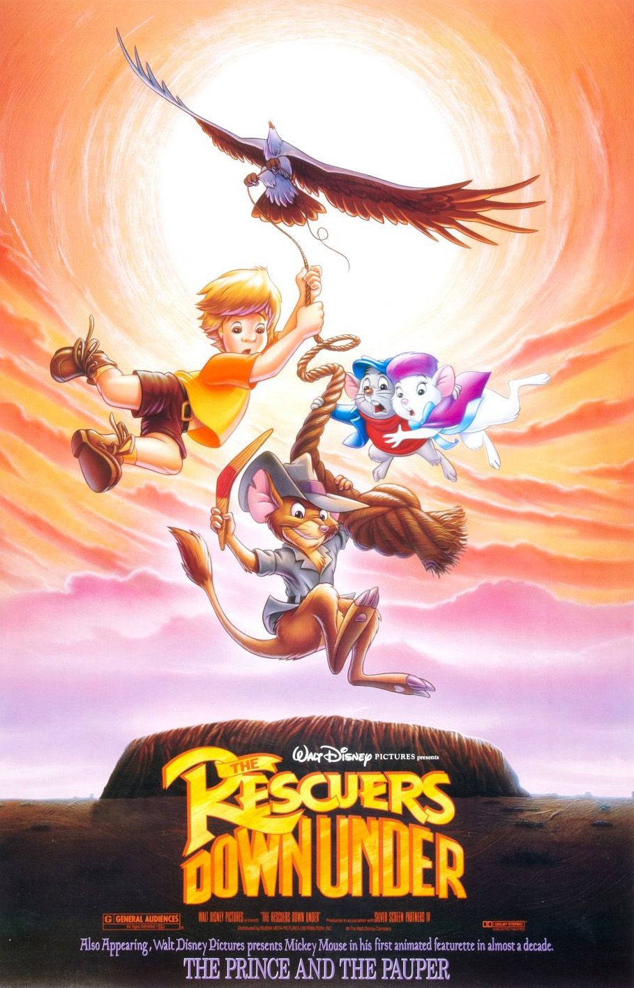
While it might not be the most popular of the Disney Renaissance films, The Rescuers Down Under was an unforgettable and visually impressive adventure in the Australian Outback with Bianca and Bernard. Compared with many of the others on this list, the film's poster might not look all that impressive, but in a way, it delivers exactly what it promises. From the poster alone, the viewer can see just what kind of film they're in for.
9 Pocahontas
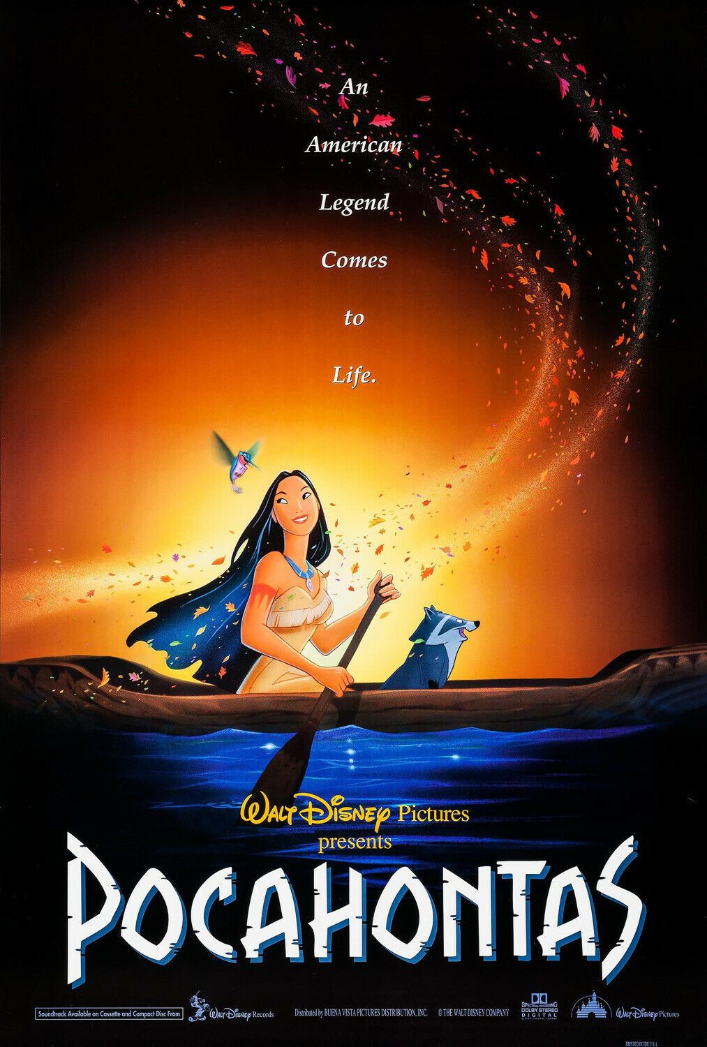
Pocahontas isn't exactly what one would call factually accurate, but to say it was a bad film would be entirely untrue. It was a Disneyfied version of an American legend, and that's precisely what this poster displays.
Simple yet effective, the poster features Pocahontas herself rowing her canoe just around the river bend as the colors of the wind swirl around her in true, magical, Disney fashion. A bit on the nose, but not without some nostalgic charm by today's standards.
8 Tarzan
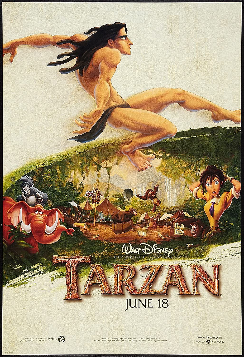
Tarzan's poster presents an interesting wedge. On one hand, it displays the basics of the film, featuring the characters in a jungle setting and Tarzan swinging above them. On the other hand, it feels slightly bare compared to some of the others featured on this list. The white with the splatter of green in the middle is an attention-getter, make no mistake, but it feels like they could have done a little bit more.
7 Hercules
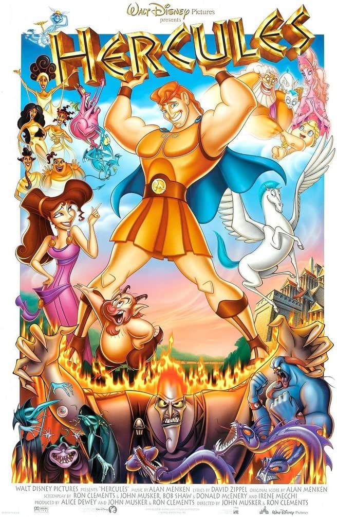
For lack of a better term, Hercules was Disney's 'comic book movie' before they acquired Marvel. Naturally, a film poster reminiscent of a comic book cover was nothing short of perfect.
The artwork practically screams "Hercules Vol. 1" and features all of the characters, gods, and mortals alike, in vibrant fashion around everyone's favorite wonderboy. Superman he might not be, but Disney definitely made something special with this one.
6 The Little Mermaid
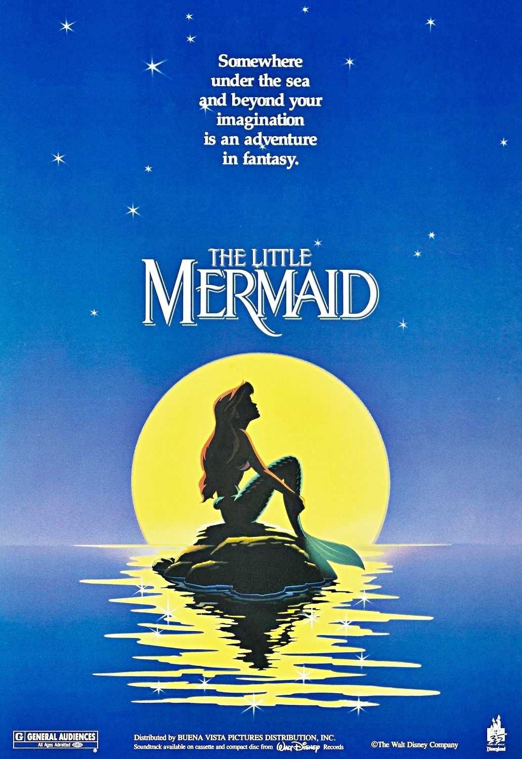
The Little Mermaid marked the beginning of something special for the posters during the Disney Renaissance. From 1989 to around 1994, the posters used shadow and light to create a unique effect. By keeping the main characters in shadow, it makes the viewer want to see the movie more. The Little Mermaid, while basic in its presentation, captures the concept perfectly with its use of simple colors and Ariel's silhouette.
5 Aladdin
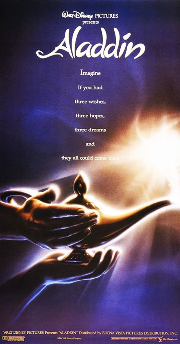
As seen with The Little Mermaid, Aladdin's poster relies on the light and shadow effects, but this time with a more mystical and mysterious method. Aladdin isn't even seen, save for his hand. The true focus of the feature, and rightfully so, is the magic lamp.
By having the light source come from the lamp instead of focusing on the central feature, the viewer is drawn to the true focus of the movie, and possibly alluding to Robin Williams's Genie.
4 Beauty and the Beast
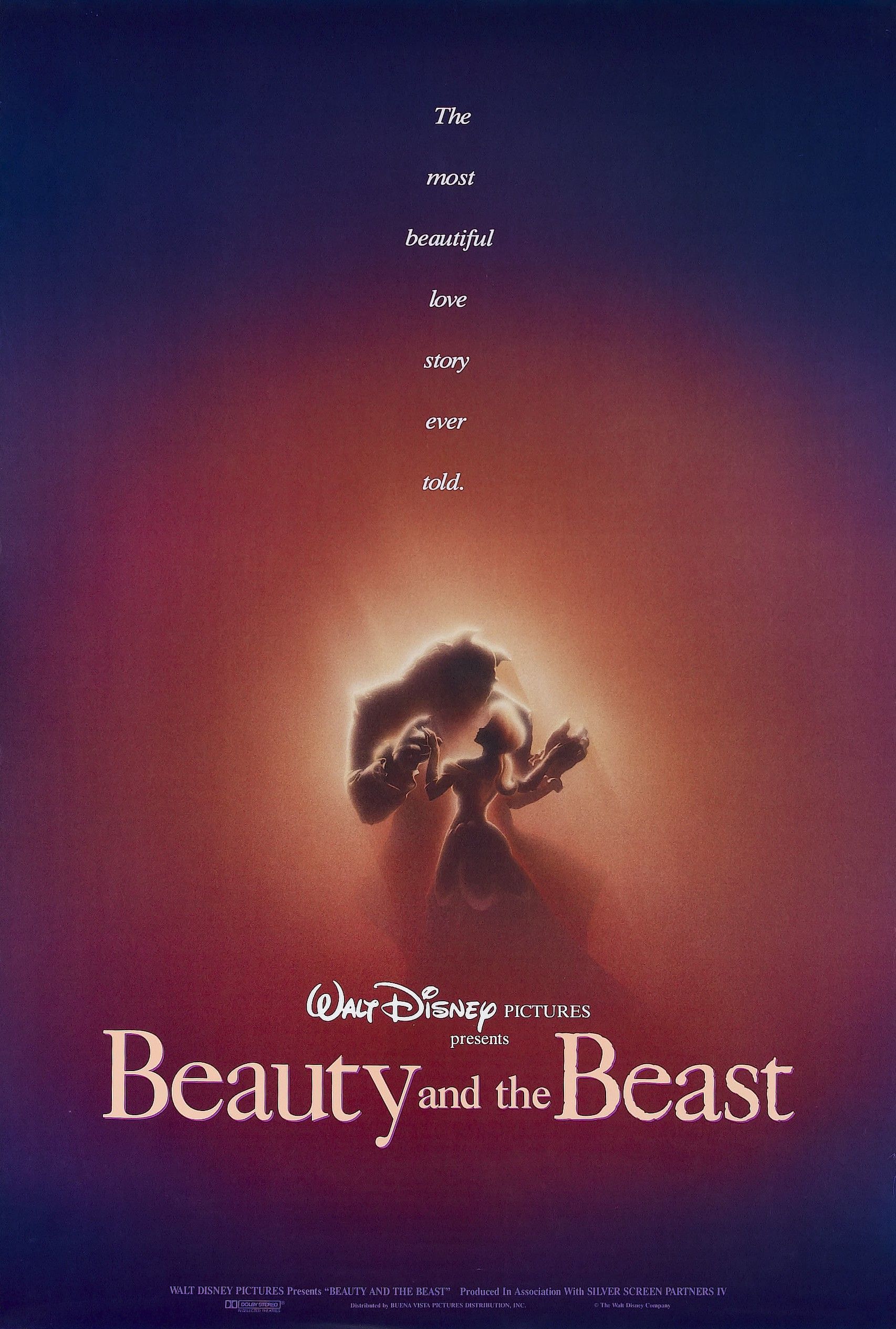
By keeping its subjects in the dark, Beauty and the Beast's poster not only creates a soft and romantic image of the two figures waltzing under a soft light but conceals the Beast's identity and appearance. It serves as a slight incitive to persuade the viewers to come see the film. It would become one of the most romantic images in film history, and this poster serves as the perfect preview for the famous ballroom scene.
3 Mulan
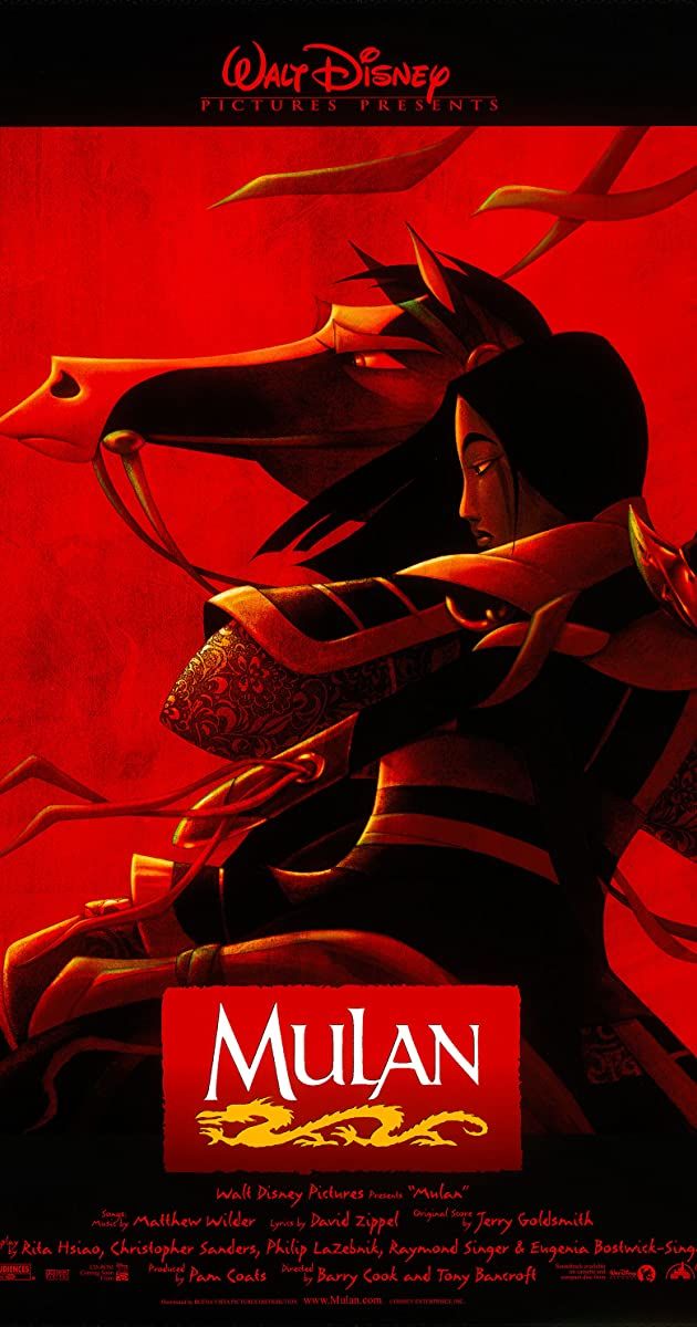
Simply and bluntly put, Mulan's poster is cool. The use of red and black hues create a slightly edgy stylistic image, and the position of Mulan in her armor on horseback gives her a terracotta-warrior-like pose.
Just because she's featured in Disney's princess lineup doesn't mean she's as dainty as the lotus in her hair. Mulan deserves to be treated like the warrior she is, and the poster totally sells that aspect.
2 The Hunchback of Notre Dame
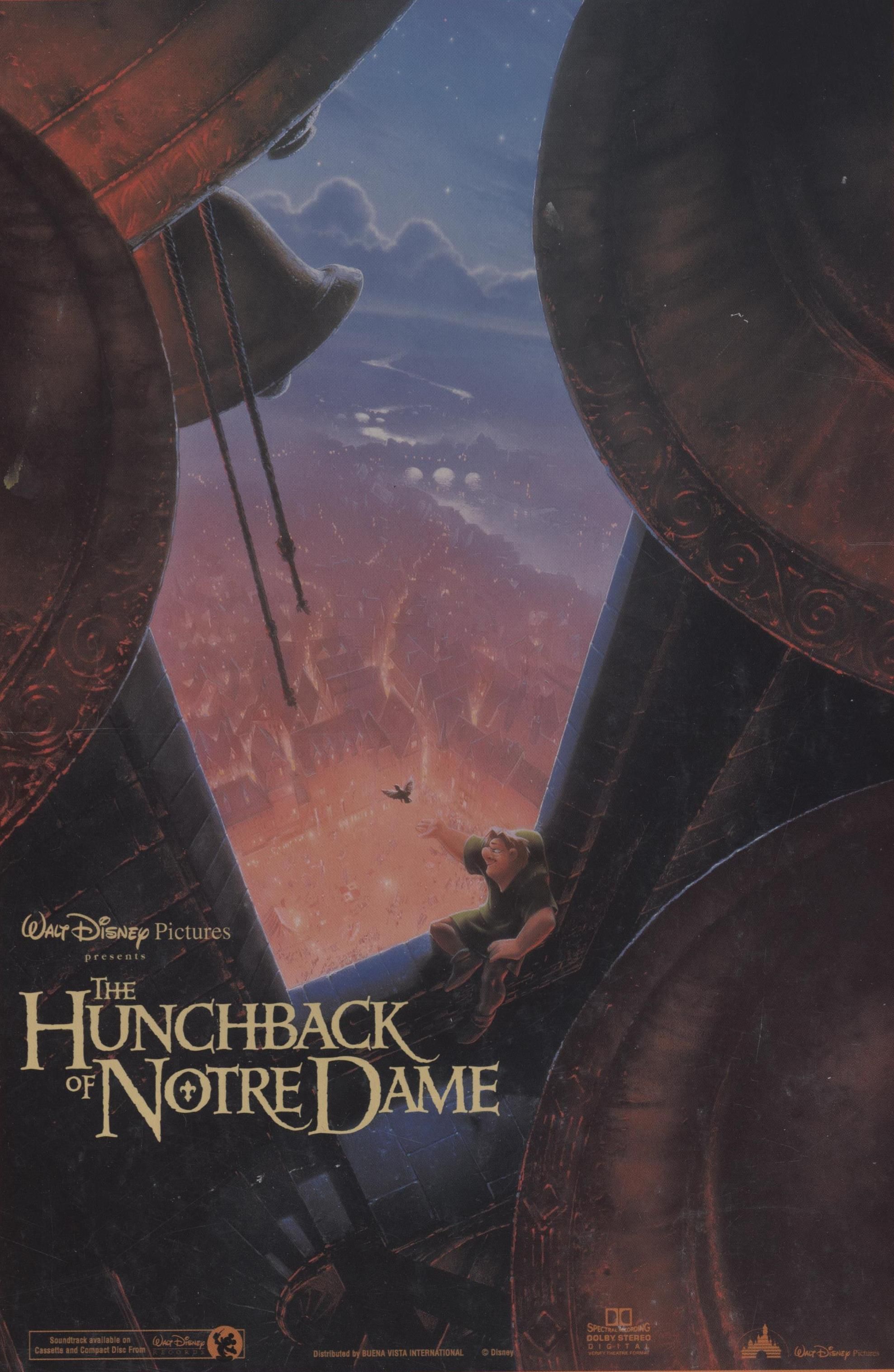
The Hunchback of Notre Dame might not be Victor Hugo's classic, but it's one of Disney's grandest and most majestic productions in the history of the company. By using the light-and-shadow method seen in other posters and pairing it with the cathedral elements of the film, the poster featuring Quasimodo in the focus is nothing short of a work of art. It truly makes the viewer want to spend one day out there.
1 The Lion King
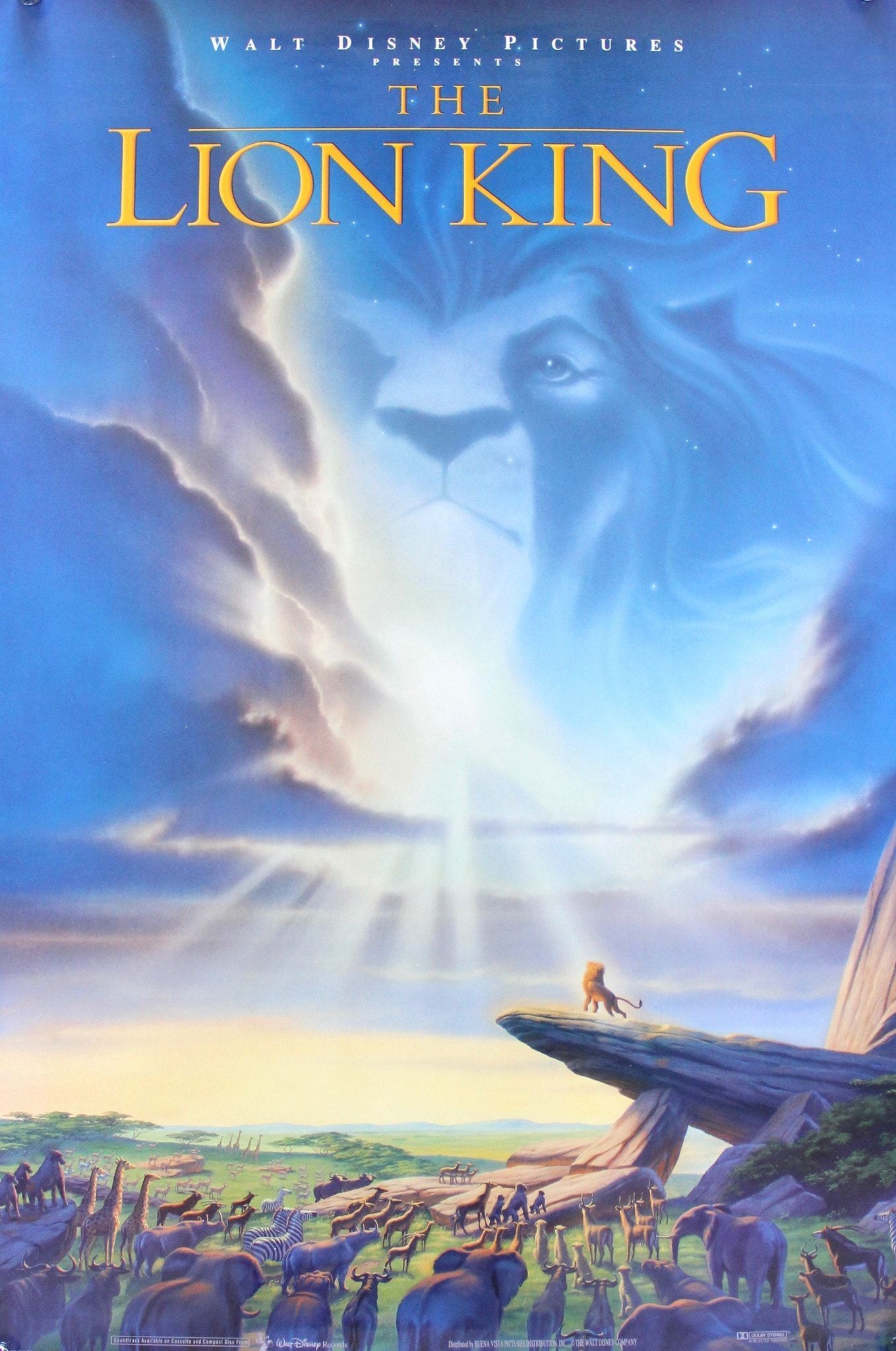
In the history of traditionally animated films, there are none so regal and beautiful as The Lion King. Naturally, the poster had to reflect every ounce of emotion and power the film conjured. The image of Pride Rock and all the animals evokes the "Circle of Life" sequence but the lightly sketched lion face in the center calls forth images of Mufasa's ghost, bringing forth two iconic scenes without spoiling the story.
https://ift.tt/3iNyyBW
October 11, 2020 at 05:30AM


