Tom Baker is widely regarded as the best of the best when it comes to playing the part of Doctor Who, and his wide-eyed toothy enthusiasm and child-like wonder continue to rope in new generations bold enough to brave the budget-challenged world of classic Who. Naturally, Baker's performance would inspire entire generations of people to take up their artistic endeavors, and the fan art community is no stranger to this.
Some of the internet's most talented fan artists have turned out wonderful renditions of the Fourth Doctor over the years, and here's 10 of the best, in no particular order. Have a jelly-baby and enjoy the exhibit.
10 That Scarf
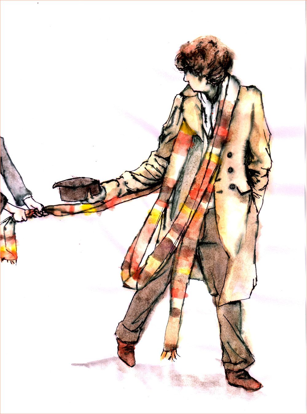
Ealish Swift opted for a combination of inks and watercolors against a blank white canvas to create this dreamy effect featuring the Fourth Doctor. His stature and proportions are perfect, right down the curly hair, and his pose is quite convincing as well.
It's a mystery as to who is tugging on his scarf, however. Is it Romana, or perhaps Sarah-Jane Smith? Perhaps that's part of the mystery. Either way, the inventive use of brown, red, and yellow watercolors is phenomenal.
9 Strike A Pose
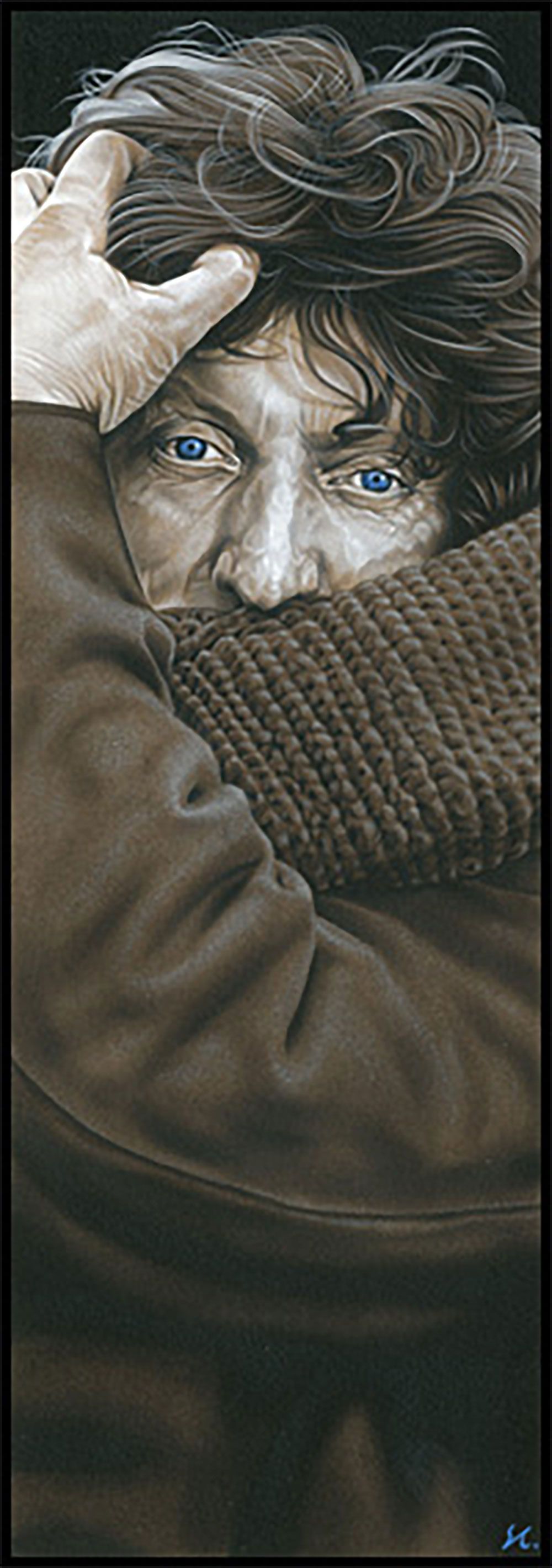
Caldwell Art did a completely different take on the Fourth Doctor with this shot that looks uncharacteristically high fashion. It's definitely not what Whovians think of when they picture Baker's Doctor, but that's the whole point of fan art - to try new things.
The super-narrow closeup creates a nice effect that draws attention to the Fourth Doctor's face, and the detail level in his scarf is excellent. Desaturated colors give the picture a washed-out feel to allow the Doctor's blue eyes to act as a focal point.
8 Portrait of a Time Lord
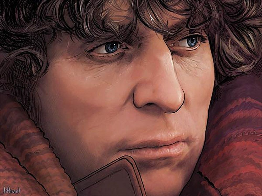
Lithrael did a digital paint-over of the Fourth Doctor in this work which shows off stunning clarity and heavy attention to detail. The crisscrossing lines in the Doctor's hair make it hard to tell whether this is a completely hand-drawn look or not, and that's the effect Lithrael appeared to be going for.
The deep warm tones make the piece pop in a way that 70s standard-def television stills simply cannot do, no matter how hard they try. Also, the angle of the shot would make any Whovian want to frame this piece and hang it on their wall.
7 The Doctor & Sarah
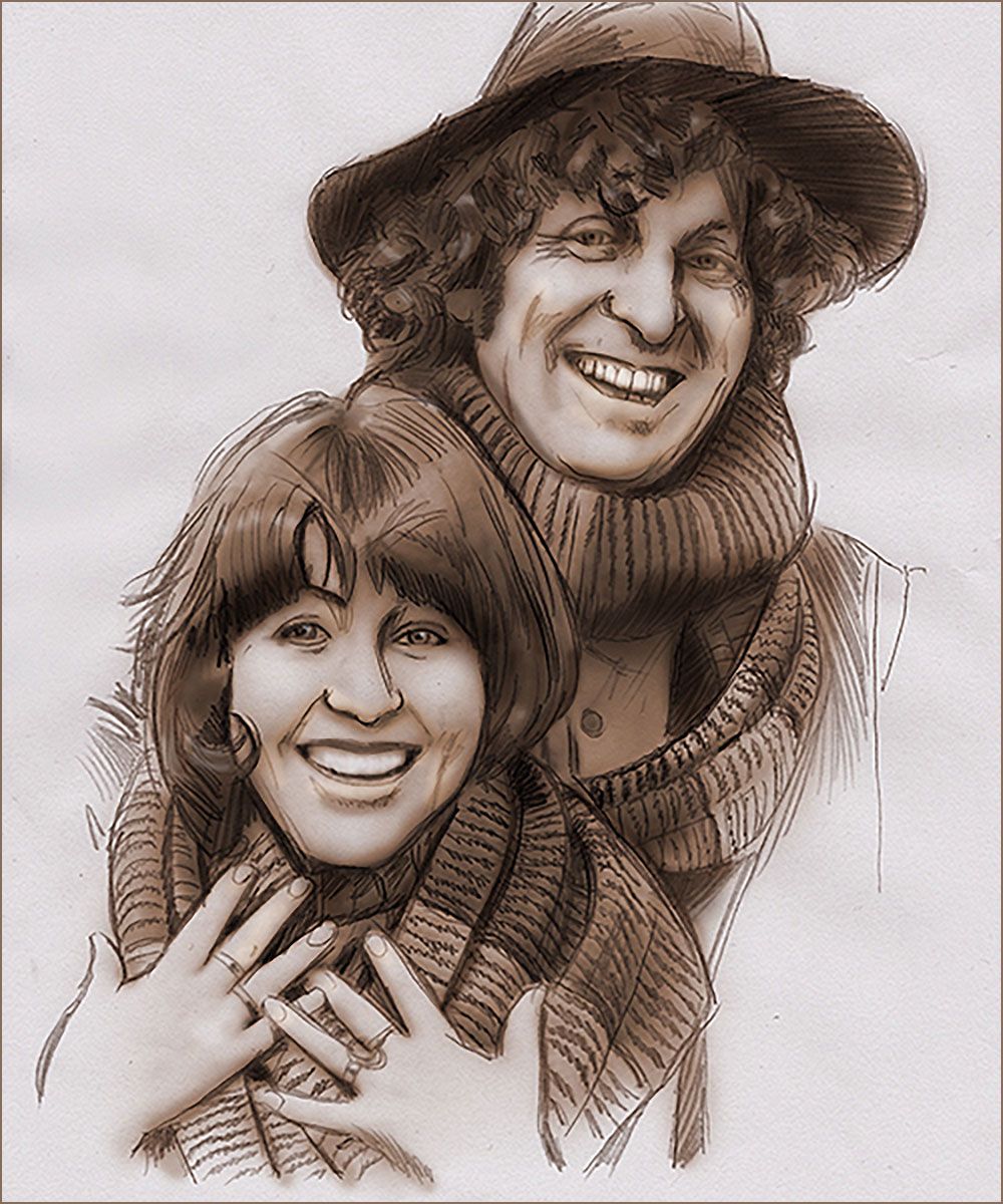
This touching portrait shows the Fourth Doctor alongside his most beloved companion - the enduring Sarah-Jane Smith. The piece by Baslergrafik is given extra emotional weight considering that actress Elizabeth Sladen passed away in 2011 after a battle with cancer.
The slightly sepia-toned colors work wonders here, as does the sketch art feel and the immaculate shading, especially in the scarf. One would be hard-pressed to find a better portrait of perhaps the greatest Doctor/companion duo of all time.
6 Wide-Eyed Doctor
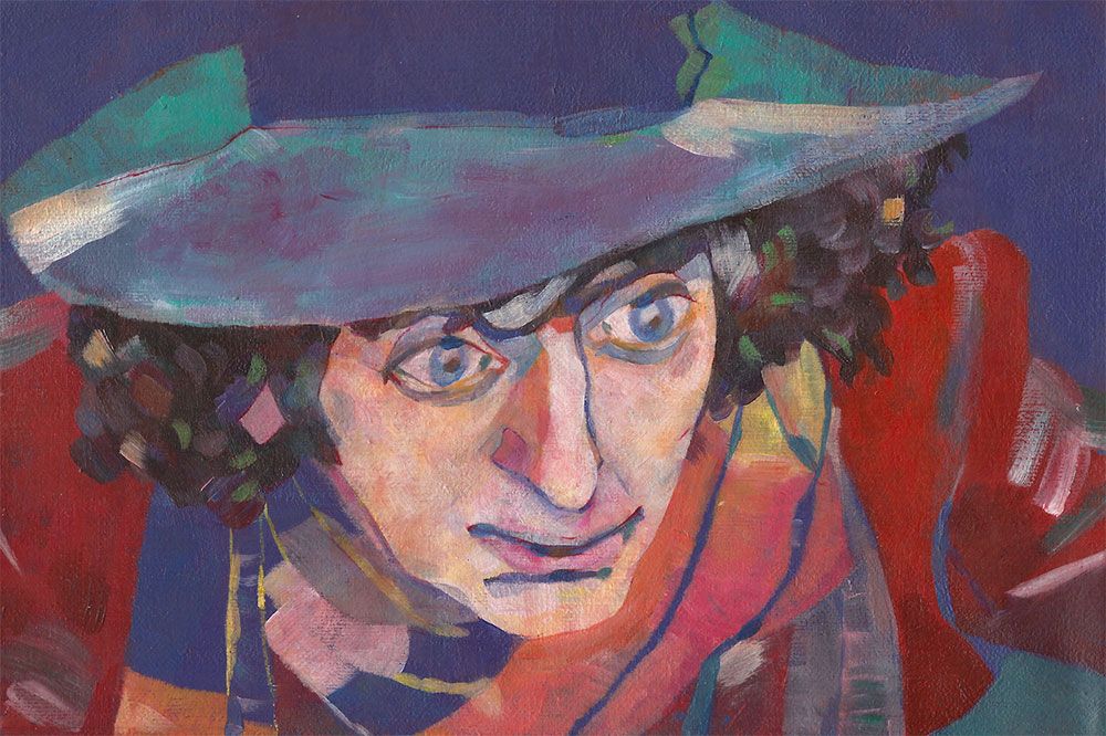
JossuJB has a distinct impressionist style that tells stories using bright paints and textures. His rendition of the Fourth Doctor is altogether unique, especially when it comes down to the detail in the face. Simple and straightforward, the piece bursts to life with a heavy emphasis on the Doctor's inquisitive nature.
Everything from the Doctor's hat to his hair and patchwork scarf are represented with abstract, yet clearly defined detail. It's far removed from many other works on this list, and that's a good thing.
5 Retro Doctor
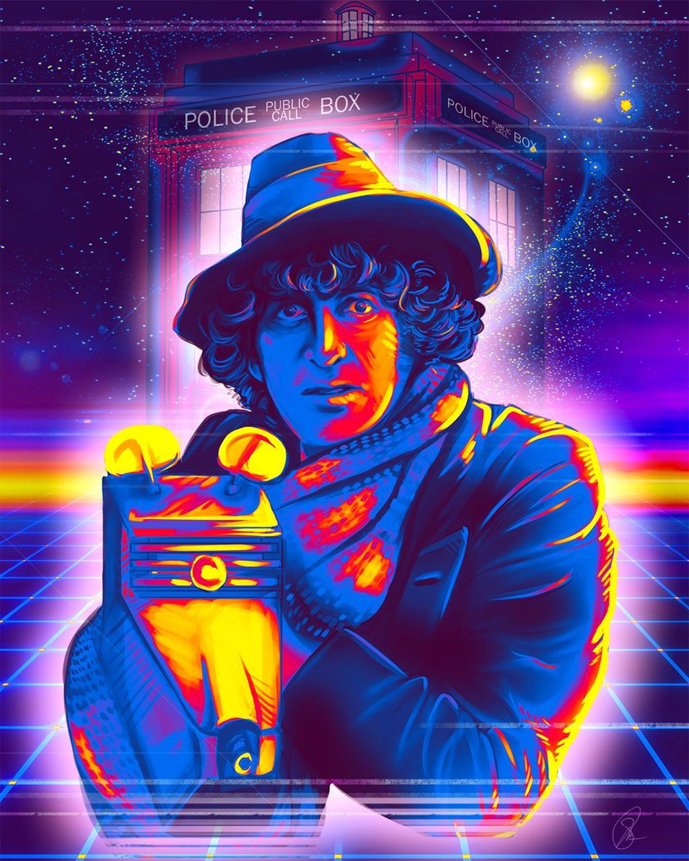
Art-By-Shiela has done quite a few Doctor Who portraits for her gallery, but this is clearly one of the most colorful. Here, Shiela goes full-on 1980s synthwave, complete with the grid-pattern background and cascading multi-color light sources - a deviation from some of her other Who works.
Having K-9 in the same shot as the Doctor definitely earns her some bonus points, as does the rich detail in the cool blues and mad-hot reds and yellows. The Tardis backdrop is also a nice touch that mixes well with cascading star effects and twin suns in the upper right-hand corner.
4 Evoking The Doctor
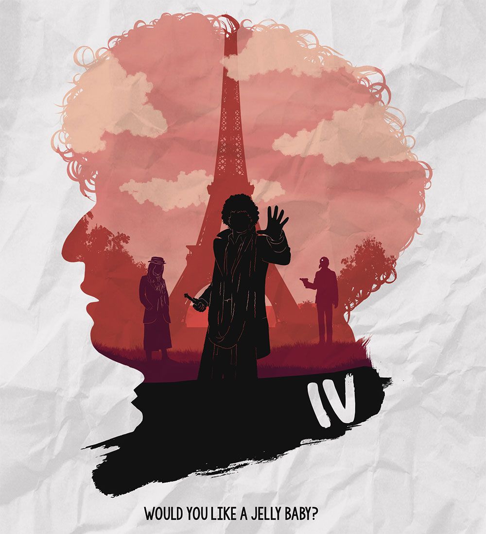
Matthew McBride keeps things simple, but incredibly stylish with this piece that features a cutout of Tom Baker's side profile which is used as the framework for the goings-on within. The stylish use of a silhouetted Eiffel Tower makes a nod to the Fourth Doctor's serials with Romana standing off to the side.
The Doctor takes center stage in the middle, complete with sonic screwdriver in hand and the roman numbers IV to the bottom-right. All this style is deposited neatly into a crumpled paper background with an all-too-familiar catchphrase at the bottom.
3 Coming Home
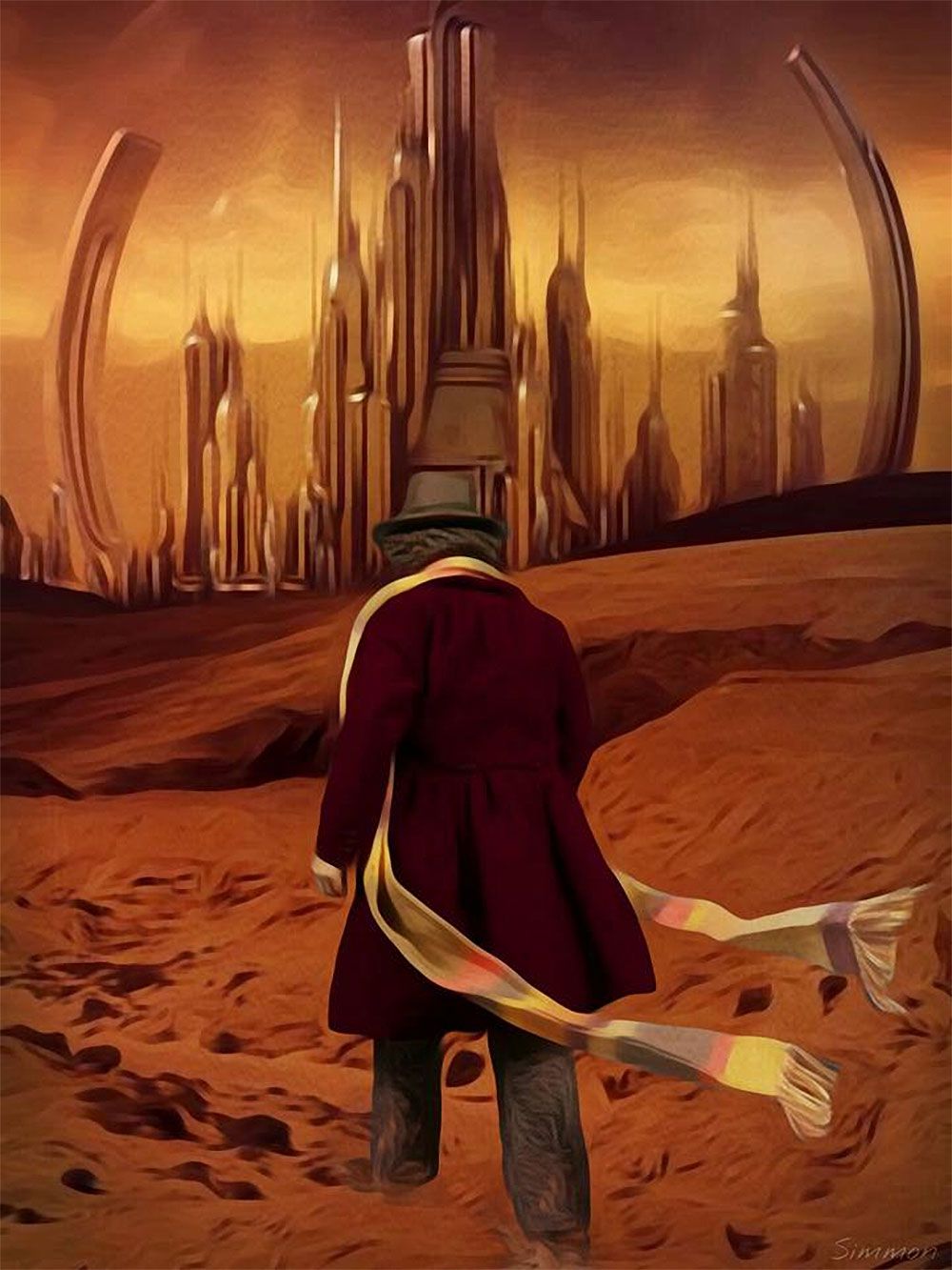
Simmon Beresford depicts the Fourth Doctor trampling through the heavy sands of Gallifrey as he makes his way to the Capitol. It's an excellent mix of the classic Doctor making his way back to a home envisioned so brilliantly in the 2005 rebooted series. The oil painting effect helps give a little abstract style to the piece as well.
The predominant use of rusty reds and deep browns is flanked by brilliant golds in the Capitol and the Doctor's scarf. This combination gives the eye two focal points to draw on, making the whole work pop to life.
2 The Doctor & Leela
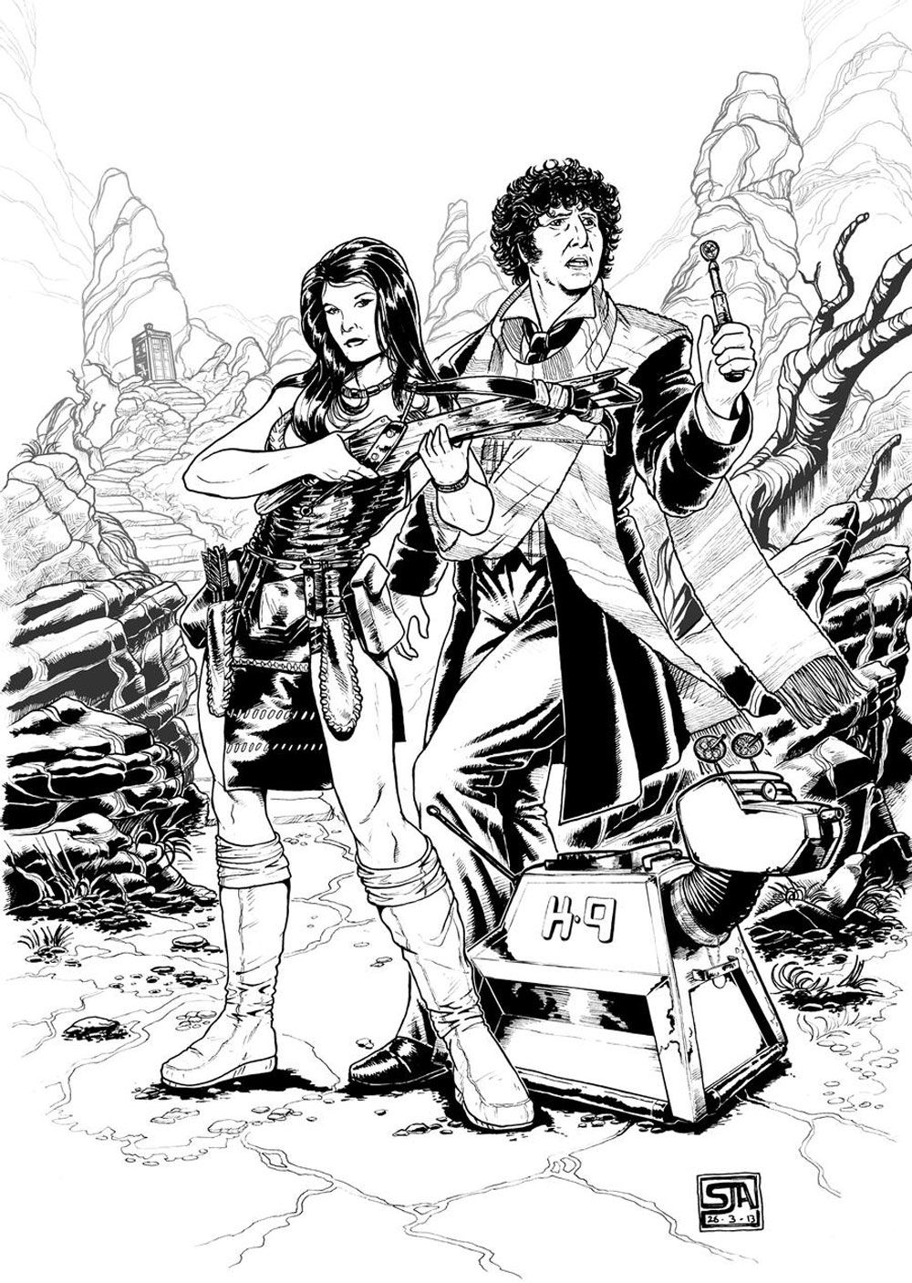
Steve Andrew loves Doctor Who if his DeviantArt gallery is anything to go by. It's no wonder he was able to craft such an excellent sketch-up of the Fourth Doctor with Leela and K-9 exploring what could be a very inhospitable planet.
The linework is superb, and the attention to detail second to none, right down to Leela's boots and the surrounding environment. One wishes the piece could be colorized just to see it come to life, but that might actually detract away from just how smashing this work is.
1 Magazine Doctor
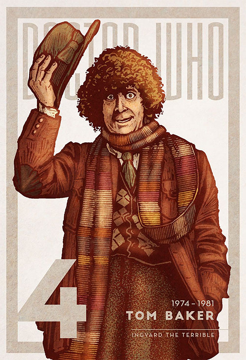
Ingvard the Terrible does an incredible take of the Fourth Doctor in what could very well be the cover of a magazine or Blu-Ray cover. Here, he captures the Doctor's signature hats-off pose with all the wide-eyed glee that the character brought to television screens.
The use of muted oranges, browns, and slight reds works very well against a sepia-toned border and accompanying text, while the grain in the picture gives the work a vintage 1960s feel. Hats off to Ingvard - no pun intended.
https://ift.tt/2FijRZO
September 08, 2020 at 05:30AM


